28.2.11

Zurich 2012


George Strouzas a design student from Athens, Greece has created this fantastic branding project of a fictional Olympic games based in Zurich, Switzerland. It is really interesting to see George's thought process and he has clearly taken all the key ingredients of Swiss design; grid, helvetica and geometric shapes to produce an interesting visual identity. I love the idea of the four sets of walking legs from each corner of the globe making up the logo. For the full Swiss experience check out George's behance.

23.2.11

Marin Dsgn

Marin Dsgn a designer based in Barcelona Spain, clearly has a penchant for modernist Swiss design as can be seen from his extensive portfolio of work on his flikr photostream. I particularly like the poster above, the simple bold vibrancy draws you in and encourages you to find out more just as all good posters should. Great work.

14.2.11

Jean Widmer


Jean Widmer (1929 - date) studied at the Kunstgewerbeschule, in Zürich, under Johannes Itten one of the Bauhaus teachers. Despite studying at the École des Beaux Arts in Paris, his work was heavily influenced by the likes of Joseph Muller Brockman and he became responsible for introducing Swiss modernism to France. His work of functionalism and simple forms stood out amongst the decorative style that were present in France at the time. And after working as art director and photographer for various companies in France he launched his own company Visuel Design in 1970 with his wife Nicole. The company successfully concentrated on French identity systems and infrastructure projects including; the identity programme for the Centre de Création Industrielle, the identity for the Centre Pompidou, and the identity for the Musée d'Orsay. Jean Widmer revolutionized signage in France both from a readability and an aesthetic perspective. Outstanding work and a true Swiss master.
13.2.11

Richard Paul Lohse


Richard Paul Lohse (1902-1988) was a Swiss painter and graphic artist and one of the main representatives of the concrete and constructive art. In 1918 he trains as a graphic artist at advertising agency Max Dalang. His graphic work during the thirties puts him at the forefront of Swiss pioneers and in 1937 with Leo Leuppi cofounds Allianz, an association of modern Swiss artists. In the 1940s his love of painting took over and he became one of the leading representatives of Concrete art. His paintings are mathematically-based, often featuring chequer-board or grid-like patterns of colour. During the fifties he published the book "New Design in Exhibitions"(1953) and was co-editor of the magazine Neue Grafik (1958). It was during this time that he also produced the fantastic work for modular furniture company Wohnbedarf. The work (as seen in the spread above) was so simple but so elegant in its execution, beautiful work.

12.2.11

Mixer


Swiss design agency Mixer are a community of talented individuals that can function as themselves or as a group. They produce contemporary modern graphics but clearly look to the past and have learnt from their Swiss contemporaries. I particularly like their poster work (above) that create real tension by shape shifting. For more great poster work by designer Erich Brechbuhl and other Mixer community members visit their website.

11.2.11

Max Huber


Max Huber (1919-92) one of the most influential Swiss designers of the twentieth century started his career by graduating from the infamous Kunstgewerbeschule in Zurich under Hans Williman before joining an ad agency in Zurich and meeting with the likes of Max Bill and Hans Neuburg. To avoid being drafted into the Swiss army he moves to Milan to join infamous italian studio Boggeri. After returning from Italy he joins Allianz in 1942 and exhibits his abstract work at the Kunsthaus Zurich with the likes of Max Bill and Richard Lohse. With the end of the war he returns to Italy and produces some of his greatest work like the poster (above) for the Autodromo Nazionale di Monza di Gran Prix. In 2005 in Chiasso the m.a.xmuseo was opened in dedication to his great work.

3.2.11

New World Order


Daniela Meloni's branding and 200 page annual report for the NWO (New World Order) is a fascinating idea that has been beautifully executed. For the uninitiated (including myself) the term New World Order is a generic term used to refer to a worldwide conspiracy orchestrated by a group of powerful and influential individuals. I particularly like the logo, created with geometric triangular forms that pays homage to the old illuminati logo. It is well worth checking Daniela's behance site for the full story. Great work.

28.1.11

Bob Noorda


Bob Noorda (1927-2010), was an internationally known graphic designer who helped introduce a Modernist look to advertising posters, corporate logos and in the 1960s along with Massimo Vignelli, the entire New York City subway system. Noorda took his Bauhaus training and created beautiful work for Pirelli, Olivetti and Alpha Romeo before founding Unimark in 1965 with Vignelli. Unimark were credited for awakening the corporate world to Modernist design thinking and for using distinctive type and images to create a consistent brand identity. His legacy lies with designs for the underground rail maps for Milan, New York and Sao Paulo that still remain today. A true legend of modernism.

25.1.11

MENSDEPT.


Ann Suvarnapunya a designer that hails from New York has created this wonderfully understated brand that uses a black circle as a simple bold symbol for this modern mens grooming salon. The strong mark contrasting with the clean typography suggests an exclusive experience that keeps it simple and to the point. If you are ever in Minneapolis be sure to pop by for the full brand experience. Great work.

24.1.11

Fad Fest


Studio Astrid Stavro based in the Balearic Islands create stripped back modern contemporary design with strong ideas that certainly have Swiss design at their foundation. I particularly like the concept work that they did for Fad Fest, an idea based on Tangrams, a Chinese puzzle made of seven geometric shapes that are put together to form a specific shape. Their website is fall of great work like this, so well worth a look.

19.1.11

Carlo Vivarelli


Carlo Vivarelli (1919-1986) was a graphic designer, painter and sculptor who was born in Zurich and studied at the renowned Kunstgewerbeschule from 1934-39 and in 1946 became Art Director at the progressive avant garde Studio Boggeri in Milan. During this time and when he returned to his native Switzerland he became one of the leaders of the Swiss Modernists and in 1958 became a co-founder of Neue Grafik magazine. In his later years he concentrated more on his concrete art and sculptures.

16.1.11

Max Schmid


Max Schmid (1921–2000) born in Rheinfelden near Basel served an apprenticeship in graphic design in the studio of Fritz Bühler where he also worked alongside Armin Hofmann. In 1948 he became art director of the pharmaceutical company Geigy design studio and for the next 23 years his designs opitimised what became known as the 'International Style'. For more of his outstanding work grab yourself a copy of 'Corporate Diversity': Swiss Graphic Design and Advertising by Geigy, 1940-1970.

11.1.11

Architectural Posters


Love these minimalist posters that show iconic architecture created with a modern illustrative slant, by Austrian design agency Exergian. Their website is well worth a look as they have some interesting work including a number of posters featuring geometric shapes to portray American TV programmes.

5.1.11

Fred Troller


Fred Troller (1930-2002) was born in Zurich in 1930 and graduated from the Zurich School of Design in 1950. He worked for Geigy Chemical Corporation and later established his own design studio in New York specialising in logos, advertising, annual reports and book sleeves for clients like Exxon, General Electric, I.B.M and Doubleday. His style was typically Swiss; manipulating geometric forms with large Sans Serif typefaces. The work he designed for Geigy and the work he carried out in the US helped define the Swiss legacy in many US design agencies in the 60s and beyond. Great work from a true design genius.

31.12.10

2K11

It's that time of the year again where we all receive those twee printers calendars which whilst useful are not stylish enough for a designers' desk. Stay cool and minimalist this year with this great desktop calendar by David Vineis of Sub88. Free to download and available in white and noir, what are you waiting for.

24.12.10

Merry Christmas

A great modernist Christmas message from Matt Jones and a perfect way to send out minimalist Christmas wishes to my family, friends and followers, have a great one.

18.12.10

AnotherDesignPoster


Kathy Kavan a designer from London has a real penchant for modernist design and has created a plethora of posters based on simple geometric shapes with aptly named titles like circle. Despite the simplicity of the compositions they really pack a visual punch, fantastic work. Kathy's AnotherDesignBlog also has some really interesting design and content including some great iphone and desktop wallpapers to download, well worth a look.

15.12.10

A2 Design


Swiss graphic design agency Idealismo are an agency after my own heart; in their 'about' section is just a quote from Josef Müller Brockmann "The grid system is an aid, not a guarantee. It permits a number of possible uses and each designer can look for a solution appropriate to his personal style. But one must learn how to use the grid; it is an art that requires practice." It states a definite intent on how they approach design and clearly they have learnt from the 'Swiss style' as the excellent example above shows. The branding for home design agency A2 is simple and understated and sits perfectly alongside A2's interiors and furnishings.


12.12.10

Ghostbox


Julian House is perhaps best known for his sleeve designs for Primal Scream, Stereolab and Broadcast and as a member of influential design firm Intro. As well as a graphic designer, he also a musician and the co-owner of the Ghost Box Music record label. The Ghost Box artwork has a unique take on Swiss modernism; it is interesting in that it retains a certain amount of formal structure and sameness with each edition however, it also changes and evolves over time while still somehow maintaining its essence and identity. Despite being very lo-fi in appearance the covers remain memorable, great work.

7.12.10

50 years of Brasilia

StudioMakgill an independent agency based in Brighton were invited to take part in a poster exhibition where 50 designers paid homage to the city of Brasilia and the legacy of its architect Oscar Niemeyer. Brasilia Prima, a design agency from Buenos Aires, organised the event for its fifth birthday which coincided with the 50th anniversary of the Brazilian city. The full set of these stunning posters can be viewed on their website and the beautiful A1 sized example above can be purchased directly from Blanka.


Ulm


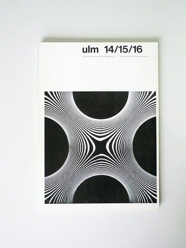
Ulm the journal of Ulm School of Design was published quarterly from 1958-1968 and provided a comprehensive account of the curriculum of one of the century's most influential design schools. The school which opened in 1953 was founded by luminaries of Swiss Design; Inger Aicher-Scholl, Otl Aicher and Max Bill. For more of these fantastic journals visit Display a curator of important modern, mid-century graphic design book, periodicals, advertising and ephemera or visit allovallo's flikr site that also showcases some of the covers to these classics.

6.12.10

Image Now


Wemakedesign were given the opportunity of creating a catalogue, invite and poster for an exhibition celebrating the Swiss design legend Josef Muller Brockmann, held at the Image Now Gallery. Some great work with creative direction from Aiden Grennelle of Image Now that perfectly pays homage to his great work.

30.11.10

Dropyx


I absolutely love this promotional poster and brand identity created by UK creative agency six for the new German creative network Dropyx. Six design beautiful work much of which is stripped right back but the message remains very strong. On their website is an invite for the Helvetica 50 exhibition organised by Blanka that takes inspiration from the original Helvetica type manuals - great work.

21.11.10

Philips-Twen

Between 1961 and 1968, the magazine Twen produced a series of LP recordings in collaboration with the Philips record label. This book 'Realism is the score' illustrates all 70 sleeves from this LP Series and includes an interview with jazz legend Klaus Doldinger, whose first three records appeared on Philips-Twen. The roster of artists/designers who contributed work for the cover art is quite impressive. Willy Fleckhaus who served as the art director for the Philps-Twen series used work by Karl Gerstner, Max Bill, Heinz Edelmann, Michael Engelmann and others to guide the look of the series. More of these excellent covers can be viewed at grain edit.


17.11.10

Otto Baumberger


Otto baumberger (1889 – 1961) was a designer, painter and illustrator. He was best known for his posters and during his career created over 230 in a variety of styles. As an employee for Zurich printers Wolfensberger AG, he acquired a sound knowledge of lithography techniques and used this in his posters to great effect. He studied in Munich, Paris and London before returning to Zurich to become assistant teacher at the Kunstgewerbeschule until 1933. His posters covered a broad gamut from painted forms to stripped back minimalist illustrations many of which were pioneering examples of the Modernist style.

16.11.10

Theo Ballmer


Theo Ballmer (1902-65) is best known for his posters of the 1920s and 30s and is considered one of the true heroes of modernist design. Born in Basel, Ballmer received part of his training at the Zurich Kunstgewerbeschule, where one of his teachers was Ernst Keller, the ‘father of Swiss graphic design’. By the time he became a student at the Bauhaus he was already an established designer and producing great work.

9.11.10

N+M


In the late 1960s Erwin Poell created these incredible covers (and others) for Naturwissenschaft und Medizin (Natural Science and Medicine) magazine. Erwin Poell a German graphic artist, trained as a lithographer and typographer. From 1951 he studied at the State Academy of Fine Arts in Stuttgart and from 1955, he worked independently. His covers conveyed complex medical and scientific theories in a very simplistic modernist way. In 1992 a book titled 'Entwürfe für den Alltag. Typografie. Grafik-Design. Art Direction' was published of his works.

8.11.10

Films in Black and Red


Designer Olly Moss has created a series of black and red film posters in a minimalistic style. For me these are the pick of the series as they are clever and well executed. Olly is also the man behind those stylish Video Game Classics book covers that have appeared all over the web. He clearly has a penchant for Saul Bass and clean minimal design.