Love this modular identity created by Barcelona based designers Andres Requena and Francesc Moret. Helsinki is a branding and communication studio based in Barcelona that has strong links with Finland. The modular design allows it to be dynamic and agile creating a strong identity that is forever changing. Some very nice work also featured on their websites.
Love these minimalist architectural posters by Italian designer Andrea Gallo aka Roosterization representing iconic architects of the twentieth century and their legendary designed buildings. To view the full set of six pop over to Arch Daily.
Going completely off track with this post with some self promotion of Konstruktive's recent personal illustration, completed and published on the behance site. To view additional images and how it was created pop over to the site and if you are feeling generous click the 'Appreciate This' button. Thanks!
Artist Simon Beck is a man on a mission. Along the frozen lakes of Savoie in France he spends days walking through thick snow in raquettes to create these beautiful and intricate geometric patterns. Due to the unpredictability of the weather these amazing artworks may take days to create as Simon may have to recreate large segments of the design if there is an unprecedented fall of snow overnight.
For more geometrical forms in the snow visit snowart8848.
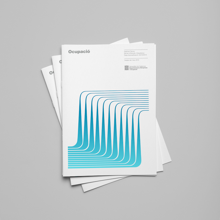
Hey Studio, a multi displined agency based in Barcelona, Spain, have a penchant for geometric forms and the Swiss 'less is more' philosophy but they make it their own by combining it with the vibrancy of Barcelona. I just love the identity above, that they designed for the Ministry of Enterprise and Labour, government of
Catalonia. Historically identities for government departments tend to be a sombre affair so it's great to see the freshness of these. The cover illustrations are
a visual metaphor for the statistic analysis and information flow contained within. Definitely worth checking out the full set and other great work on their website.
Keeping with the Olympic theme this wonderful typeface designed by Astrid Stavro studio has been created in the appropriate 3 different weights of Gold, Silver and Bronze. (Bold, Regular and Light) These stylised LDN postcards were created for the Random Project. The project is a growing collection of postcards created by everybody and celebrates the spirit of London and 2012, visually documenting this historic year. The typeface soon to be released by Astrid Stavro is appropriately called London'12. Great work.
I am sure many of you have seen the recent stamps released by the British Royal Mail that are doing the rounds on various design blogs. Whilst the stamps, designed by perennial favourites Hat-trick design, are stunning, combining both athletes and iconic architecture I prefer the simple solution they used for these alternate Olympic coin covers. The simple pixelated designs based upon the Olympic medal shape work really well at this size and I love the contrast between image and stamp/coin. You can view the full set on their flickr feed.
I have recently discovered Lamosca a design agency that hails from Barcelona, Spain. They have a real penchant for clean Swiss typography and colourful, bold, geometric shapes. As well as producing identities and exhibition work they also create very interesting infographics that you may have come across, in publications Monocle, Wired and La Vanguardia. Definitely one worth checking out.
I love the bottle and minimalist typographical treatment for this premier olive oil 5. Full credit to Greek design agency Designers United for moving away from the typical images of olives and olive groves to produce this wonderful contemporary design. Konstruktive also had the fortune of creating some packaging for olive oil Moo for a limited run of 8 bottles!