Following on from my previous article regarding the fantastic Typographische Monatsblätter journal
there is now a dedicated resource that focuses on the periods from 1960 to 1990. The TM Research Archive is a website that was initiated by Louise Paradis and set up by ECAL/University of Art and Design Lausanne in order to provide a reference tool for both personal and educational purposes. It is interesting to see how cover design styles have changed over the different decades but for me the simplicity of the covers created in the early 60s and the geometric styles from the 50s really stand out. Be sure to bookmark this site as there will be a series of interviews with some of the outstanding designers that have contributed over the years.
If you read Hey Studios profile it cites that they always wanted to have their own style, one that when looking back would look pure and consistent, (not unlike the old swiss masters). The ingredients they chose for this were geometry, color and direct typography. I am pleased to say their body of studio work certainly lives up to it as you can see by these recent brochure catalogues for Agenda CCCB. The Centre de Cultura Contemporània de Barcelona (CCCB) organizes exhibitions, debates, festivals and concerts and encourages creation using new technologies and languages. For more geometrical goodness take a sneak peak at their website.
It's not often that you can say that you would want to be 'pulled over' by the local police force, but, in the Netherlands I may just make an exception. Can you believe that this visual identity by perennial favorite Studio Dunbar was created back in 1992 and launched in 1993! It still looks as fresh today as it did then, which is testament of a sustainable corporate design system. Check out the 911 cabriolet, I would not have believed this existed if I hadn't actually seen one for myself on a visit to Amsterdam. Then again it could have been the space cake!
Interesting concept by designer Sasha Kischenko from Moscow in Russia for a Swiss brewed Helvetica Beer. Check your kerning and asymmetric layouts after 6 pints of this stuff!
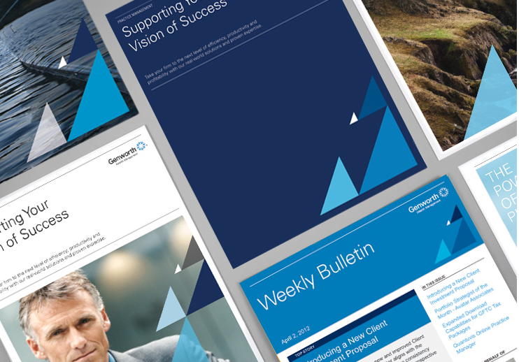
Stunning piece of branding by Tolleson Design for Genworth Financial Wealth Management. Faced with the challenge of three distinct business units with their own mix of collateral they created an identity that was flexible enough to bring all divisions together under a single brand whilst still maintaining their individual offer. The identity paid homage to their existing brand by continuing with the nautical inspired design theme. Click through for the full story and to see how the application of the visual design system works across multiple items.
Love these set of posters by Monotono, designed to challenge you by showing you familiar shapes in a different context. With a minimalist aesthetic, what is taken out is as important as what is shown. They have kept with the less is more on approach on their website, I particularly like their mantra...
What is boring? Boring is the absence of a good idea. At Monotono, we believe that
nobody suffers from boredom when they’re making something beautiful. And
we’d rather die from exhaustion than boredom.