11.11.12

Simple Stucture


Simple things please me and it does not get much simpler than these set of prints by polish designer Michał Stróż. Taking the simple geometric forms of cross, circle and square to create something that resembles a 3D isometric form. For more interesting work visit his site at prograffic.

Morella House


Absolutely love this modern minimalist house designed by Italian architect Andrea Oliva of Citaarcgitettura Studio which he founded in 2000. Andrea graduated from Politecnico di Milan with a degree in architecture in 1998 and then worked with the Architecture and Engineering Faculty at Parma University before going it alone. His idealisms are based on creating new spatial solutions to fit the urban landscape with a special focus on sustainable homes. The Morella House is 34 metres by 11 metres with a height of 6 metres. The house is made up of 2 elements the concrete formed rectangle and the grey body contained within it. The flat roof houses many solar panels that provide the home with electricity and water.

16.10.12

Hans Hilfiker


I absolutely love the new swiss inspired clock app that Apple have created for ipads running IOS 6 and am pleased to hear that they have agreed terms with the Swiss Federal Railway Service (SBB) to license it.

In 1944, Hans Hilfiker (15 September 1901 – 2 March 1993) working for the Swiss Federal Railways, designed the Swiss railway clock, which went on to became a national icon. Hans was both and engineer and a designer and was an exponent of products that were both functional and well designed. As an SBB employee he was given the task to design a visible clock that would form part of the corporate identity and help unify train departure times across Swiss railways. A true classic Swiss design with its simple white face, contrasting black lines and without a number in sight! Against the white and black is the red second hand or the 'rote kelle' (red signal), as it became known, for its close resemblance to the station managers hand held signal that signified a trains departure.

11.10.12

Limited Edition


Going slightly away from the Swiss inspired themes that normally adorn these pages is this fantastic project by designer David Sedgwick. I am always inspired by projects which have a certain level of craftsmanship and this beautifully printed piece which started as a conversation between David and GF Smith's Jane Crowther certainly is that. The 'limited edition' of 250 became a promotional piece that not only showcased a variety of different paper stocks, but also became an opportunity to highlight the work and techniques carried out at The Craft and Design Centre in Manchester. Add to this the stunning photography by duo Shaw & Shaw and you have a piece of print that hits all the senses. For more fine work David's website is well worth a visit.

10.10.12

China Navigation Company


I love these policy posters created by Singapore based designer Gene Wang. He has taken the simple geometric forms from the Swire Group logo to create a layout that adds some visual interest to the dry subject matter of company policies. In Gene's words "The two triangles form an optical projection that represents the vision of each policy." For more of Gene's work visit his behance site.

9.9.12

Franz Fässler


Love this poster and catalogue by Franz Fassler (1920-2003) for the G59 - 1st Swiss Horticulture Exhibition which took place from April 25 to October 11, 1959 in Zurich. The goal of the G59 was to promote Swiss horticulture and give young people an understanding of horticulture and landscape architecture. Whilst the minimalist 'Poets Corner' by landscape artist Ernst Cramer became the most controversial piece of horticulture with its abstract geometric principals, the G59 also provided an opportunity for brochures, posters and labels to be designed in the typical modern Swiss style. 

Despite finding some some cracking work by Franz, I found very little information on him so if anyone knows any more about this great Swiss designer please let me know.

27.8.12

Helsinki


Love this modular identity created by Barcelona based designers Andres Requena and Francesc Moret. Helsinki is a branding and communication studio based in Barcelona that has strong links with Finland. The modular design allows it to be dynamic and agile creating a strong identity that is forever changing. Some very nice work also featured on their websites.

21.8.12

Architects Posters


Love these minimalist architectural posters by Italian designer Andrea Gallo aka Roosterization representing iconic architects of the twentieth century and their legendary designed buildings. To view the full set of six pop over to Arch Daily.

16.8.12

I am lost

Going completely off track with this post with some self promotion of Konstruktive's recent personal illustration, completed and published on the behance site. To view additional images and how it was created pop over to the site and if you are feeling generous click the 'Appreciate This' button. Thanks!

13.8.12

Snow art


Artist Simon Beck is a man on a mission. Along the frozen lakes of Savoie in France he spends days walking through thick snow in raquettes to create these beautiful and intricate geometric patterns. Due to the unpredictability of the weather these amazing artworks may take days to create as Simon may have to recreate large segments of the design if there is an unprecedented fall of snow overnight.
For more geometrical forms in the snow visit snowart8848.

12.8.12

Enterprise and Labour


Hey Studio, a multi displined agency based in Barcelona, Spain, have a penchant for geometric forms and the Swiss 'less is more' philosophy but they make it their own by combining it with the vibrancy of Barcelona. I just love the identity above, that they designed for the Ministry of Enterprise and Labour, government of Catalonia. Historically identities for government departments tend to be a sombre affair so it's great to see the freshness of these. The cover illustrations are a visual metaphor for the statistic analysis and information flow contained within. Definitely worth checking out the full set and other great work on their website.

6.8.12

London'12


Keeping with the Olympic theme this wonderful typeface designed by Astrid Stavro studio has been created in the appropriate 3 different weights of Gold, Silver and Bronze. (Bold, Regular and Light) These stylised LDN postcards were created for the Random Project. The project is a growing collection of postcards created by everybody and celebrates the spirit of London and 2012, visually documenting this historic year. The typeface soon to be released by Astrid Stavro is appropriately called London'12. Great work.


3.8.12

Olympic coin covers


I am sure many of you have seen the recent stamps released by the British Royal Mail that are doing the rounds on various design blogs. Whilst the stamps, designed by perennial favourites Hat-trick design, are stunning, combining both athletes and iconic architecture I prefer the simple solution they used for these alternate Olympic coin covers. The simple pixelated designs based upon the Olympic medal shape work really well at this size and I love the contrast between image and stamp/coin. You can view the full set on their flickr feed.

2.8.12

Lamosca


I have recently discovered Lamosca a design agency that hails from Barcelona, Spain. They have a real penchant for clean Swiss typography and colourful, bold, geometric shapes. As well as producing identities and exhibition work they also create very interesting infographics that you may have come across, in publications Monocle, Wired and La Vanguardia. Definitely one worth checking out.

1.8.12

5 Olive oil


I love the bottle and minimalist typographical treatment for this premier olive oil 5. Full credit to Greek design agency Designers United for moving away from the typical images of olives and olive groves to produce this wonderful contemporary design. Konstruktive also had the fortune of creating some packaging for olive oil Moo for a limited run of 8 bottles!

31.7.12

Stockholm 67

I have always been a fan of Swedish furniture (not the ikea kind) as they combine a simple aesthetic with well crafted materials so loved this poster by Swedish Bo Lundberg which is equally beautifully crafted. Bo received his first international commissin for Wallpaper magazine in 1998 and has since worked for various clients around the world. Great work.

23.1.12

Nord Fridge concept


Russian designer Olga Kalugina has created this wonderful fridge concept that features geometric shapes. There is light on the doors that shows through when the fridge is on. The geometric forms continue inside with an innovative triangular shelf that can store bottles of your favourite beer! what more could you ask for. More information and further images over at Olga's behance.

22.1.12

Philographics


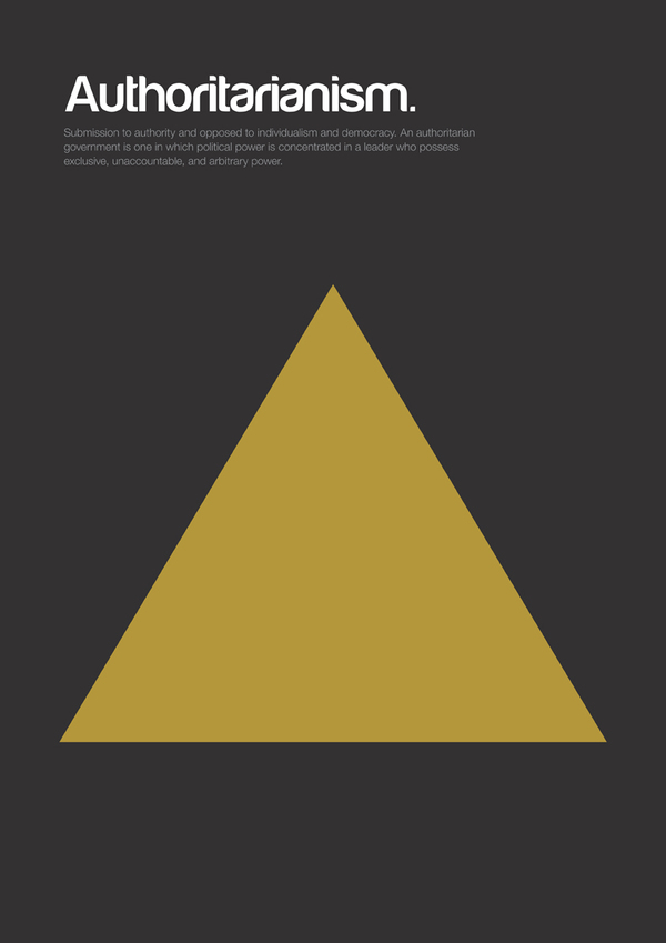
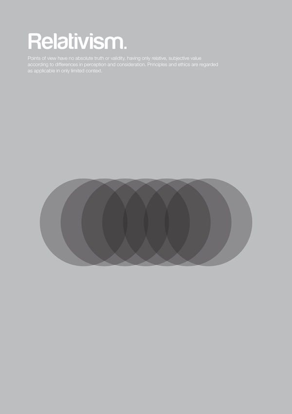
London based designer Genis Carreras has created a series of minimalist posters that attempt to explain philosophical theories. All of the posters have been included in a short journal called Philographics that explain philosophy through simple design. Accompanying each image is a short descriptor of the work. You can view all of the posters and the journal on his website.