In such a visually polluted environment Quim Marin an Art Director hailing from Barcelona trys to come up with fresh and memorable designs with a clear aim at essential beauty and equilibrium that, at the same time, will ensure communicative effectiveness. You can clearly see where his inspiration has come from and that is no bad thing. His website is well worth a visit as there is an absolute plethora of poster designs which are a real treat to the senses.
There is something about Hey Studios work that even when looking back on older work it still looks very fresh and modern. Hey's use of geometry, colour and simple typography really underpin their design ethos. The work for the open air cinema season is based on a different
topic every year and for Gandules 2013 the topic was based on humour as
a means of escape. Hey's illustration of a childs windmill toy, which is executed brilliantly, is representative
of this idea.
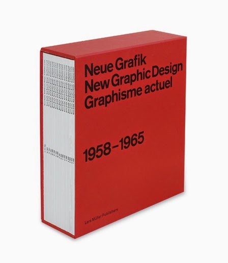
As many of you are aware a facsimile reprint of all issues of Neue Grafik/New Graphic Design/Graphisme actuelwhich ran from 1958–1965 is now available from Lars Müller Publishers. This reprint covers the complete 18 issues with editorial content from Swiss Design luminaries; Josef Müller-Brockmann, Richard Paul Lohse, Hans Neuburg and Carlo Vivarelli.
To celebrate the launch of this important part of Graphic Design history the wonderful guys at Image Now have created a mini-website and shall be promoting this iconic reprint in their gallery. The exhibition/launch will run from October 24th till November 28th in Dublin, Ireland, be sure to check it out.
Interesting concept for a fictitious German football team, FC Wurzburg! created by US designer Craig Pinto. The logo was designed to resemble the Bavarian Mountains with a
contemporary abstract assemble of geometric triangles, that form the mountain
range. It is great to see a different spin on the football kit and the triangles are subtle enough to not upset the traditionalist!
It's that time of the year when the new year calendars come flying through the studio door, shouting for our attention and hoping to be used instead of the obligatory iCal.
The 'numerario' calendar is unique in that it is made up of only numbers, without days, months or years, it is therefore never out of date! The pages are divided in two so that you can combine any combination of the numbers in order to represent a day or a month in any given year.
It comes in four languages, English, Italian, French and German and is printed on Watercolor White 280 gr. paper in two colour.
This fantastic calendar idea was created by Italian design studio muschi&licheni. For more of their interesting work take a look at their website.
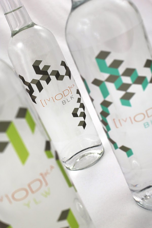
I cannot get enough of bottles with geometic patterns on, and these vodka bottles are certainly no exception. The cube design along with the modern twist on the typography help to give it, its own flavour. The design was created by Erin Pille of Omaha, USA.
Very distinct and stripped back unofficial packaging re-design of Klean Strip products. The company produces all manner of solvents, thinners and removers and the clean no-nonsense typography and bright colours really help theses stand out. Amazingly this was a personal school project by designer William Kitchens from Sugar Hill, USA. This project is not associated in any way with the brand Klean Strip®.
Loving the new Elements range for L'Oreal created by French creative director Romain Roger. Simple clean geometric icons that represent the individual names for each product. Combine this with fresh colours set against a contrasting black background and you have fresh looking luxury product that fits perfectly with their other ranges.
These amazing adverts were created by Giovanni Pintori (1912-1999). An Italian painter and designer who in 1930 won one of two scholarships of Consorzio dell'Economia Corporativa and began to study at the ISIA in Monza. In 1936 after graduating he got offered a job working within Olivetti's advertising department in Ivrea. In 1940 he became manager of the department and in 1950 he received the Golden Palm of the Italian Federation of Advertising, the first of many design and advertising awards. In 1952 after many years of creating impressive work for Olivetti, MoMA in New York organized the exhibition Olivetti: Design in Industry, which featured much of his work. Giovanni continued to design over next decade and to win many more awards. In his later years he devoted his time to painting until his death in 1999. For more of his great work have a look at theMoMA collection.
If Motif's wine tastes as good as their bottles look then your palate is in for a wonderful treat. These fantastic colourful geometric wine labels were designed by Kristina Bartosova of multi-displined design agencyEN GARDE. Their website is well worth a look as they have some visually stunning work.
Love this minimalist identity by New York design student Jessi Tsai. Japan Society is the leading U.S. organization committed to deepening
mutual understanding between the United States and Japan in a global
context. The architecture and the staircase inside of
the building, located at 47th street and 1st avenue in New York City has been the inspiration for the logo and graphic language. To see more of this project check outJessi's behance.
We were recently contacted by Japanese company North East, a recent start up, that produces fantastic tees by collaborating with top designers, illustrators and photographers. The above designs as follows; Waves to Tokyo designed by Believe in, Peace & Love Build designed by Build and Saturn designed by Sawdust. All new T-shirts pre-ordered by October 14th will receive a 10% discount. Orders will be dispatched from October 15th onward. Delivery is free for anywhere in the world (with the exception of certain regions).
It's not very often that I get the chance to showcase some fine art on this site so I am delighted to showcase the work of Marcus Hollands a designer based in Melbourne, Australia. These fantastic geometric designs are 600 x 900 mm in size and have been created by painting enamel on plywood. A good balance of minimalism and hand craft.
The old adage less is more certainly rings true with this minimalistic piece of branding for an urban design / architectural studio based in Sao Paulo, Brazil. The branding created by Mexico's favourite design agency Anagrama was based upon 2 simple elements, a geometric sans serif applied to a firm grid and a red diagonal slash that represented the young firm's dynamism and innovative personality. The simplicity is what makes this brand work especially in a country that are more renowned for their flamboyancy and bright colours. Anagrama produce some fine design work so definitely take a look at their website.
Bright colours, minimalist design and visual puns for the these A5 postcards designed for Japanese restaurant Two Sticks, need we say more? Simplistic fresh work by /ra Sm based in Moscow Russia.