 Not sure if these milk cartons, designed by Arantxa Reus, are just a concept, but I love the way Bold, Regular and Light determine whether the milk is whole, semi-skimmed or skimmed. If only shopping was this simple.

28.9.10
International Style Packaging
Not sure if these milk cartons, designed by Arantxa Reus, are just a concept, but I love the way Bold, Regular and Light determine whether the milk is whole, semi-skimmed or skimmed. If only shopping was this simple.
The Palace of Culture
 Lovely piece of signage done in the International Style and utilising an unusual colour palette, cream and black. See more of Mihail Mihaylov's work over at Behance.
Counter Print
 Ever wondered where you can obtain all those fantastic out of print books designed by such masters like Wim Crouwel (above). Browse over to Counter Print where you will find a site dedicated to Art and Design printed material some of which are for sale, grab yourself a rare bargain.
Typographische Monatsblätter
 In 1952 Schweizer Graphische Mitteilungen (SGM), Revue Suisse de L’imprimerie (RSI) and Typographische Monatsblätter (originally founded in 1933) joined forces and merged into a single monthly periodical titled TM (Typographical Monthly). TM had some major contributors such as Emil Ruder that helped develop this publication into the premier Swiss typography and printing periodical of its time.
24.9.10
Bauen+Wohnen
 Bauen + Wohnen is one of the major technical magazines for architecture and urban-planning of German-speaking Europe. It critically discusses and analyzes the relationships between architecture and its related disciplines and it typically focused on International Switzerland. Between 1947-1956 Richard Paul Lohse was responsible for the design. In 1952 a German version of the magazine was launched and his beautiful one colour covers for the first 12 issues are displayed above. In 1953 he published the book "New Design in Exhibitions", and from 1958 he is coeditor of the magazine Neue Grafik/New Graphic Design.
21.9.10
Scoreline Prints

Every now and then an idea comes up that is so brilliant in its simplicity that you wished you had thought of it. The award for this goes to the Scoreline prints featured by Blanka. They are understated but obvious and also very cool. Would love to know who designed them?
18.9.10
Bridging the Gap Posters

 Loving these posters in the International style created by Ross Gunter as a personal project for a club night in London. There is some great work on his site and an interesting navigation system for his folio.
17.9.10
Modernist book design 1925-1965

13.9.10
Masterworks of Modern Architecture

Emil Ruder

Fantastic set of Emil Ruder (1914–1970) posters featured at 80 magazine. Ruder a Swiss typographer and graphic designer, who along with Armin Hofmann helped to found the Schule für Gestaltung Basel (Basel School of Design) and the graphic style known as the Swiss Style.
Ruder was a contributing writer and editor for Typografische Monatsblätter. Ruder's publication Emil Ruder: Typopgraphy helped spread the Swiss Style throughout Europe and North America.
11.9.10
Tamar Puzis Architects branding

Very nice piece of modern day branding based upon the Swiss style created by London based designer Hila Ben-navat well worth checking out the full brand and commentary over at Behance.
10.9.10
Save the date
 Although this is for 9 October and not today! it is great poster in the swiss style and it's announcing The fourth Annual DOCOMOMO US Tour Day which will include more than twenty modern architecture tours throughout the United States. DOCOMOMO is an acronym for the DOcumentation and COnservation of buildings, sites and neighborhoods of the MOdern MOvement and promotes the study, interpretation and protection of the architecture, landscape and urban design of the Modern Movement.
Swiss Graphic Design
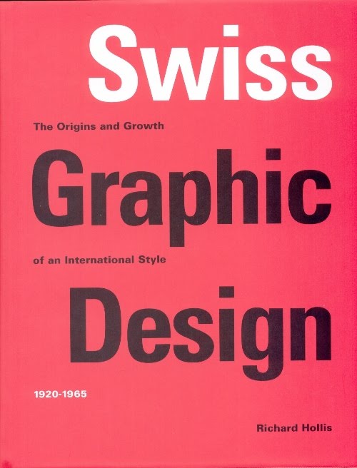 I have just taken receipt of the above and it is an absolutely must for anyone interested in the International Style. Richard Hollis' in-depth and passionate research into the subject really shines through and he explains the origins of how it started in Russia, Germany and the Netherlands in the 1920s before it found a firm foothold in Switzerland. They organized text and images into geometrical grids and developed the modernist graphic language into 'Neue Grafik' or 'Swiss' style.
7.9.10
Basler Theater

 Found this image on the Abduzeedo site and a good article on the Swiss style.
Would be interested to hear from anyone who may know the designer for this?
It reminds me of the poster recently done by Michael C. Place for Coast Modern.
Armin Hoffman
 It's hard to believe that the poster above was designed in 1954, the typography looks so current. Armin Hoffman was instrumental in developing the graphic design style known as the Swiss Style. He is well known for his posters, many of which have been displayed in major art galleries. He also published a book called his work, quest and philosophy displaying perfectly his economical use of colour.
6.9.10
Grid App
 Well not quite a grid app but as good as... you can download and set it as your background and line up your apps in a perfect grid. I am a big fan of Grieg Anderson's work in particular his new twist on old items...spirograph posters and cassette pin badges.
5.9.10
HelvetiPress

Living the dream

It does not get much better than this... a porsche 356 set within fantastic modernist architecture and photographed by the great Julius Sculman (October 10, 1910 – July 15, 2009). You can see more of this fantastic building and photography at the excellent daily icon.
Eames stamps

Love these stamps that celebrate the work of Charles (1907–1978) and Ray (1912–1988) Eames. As well as making major contributions to modern architecture and furniture they also worked in the fields of industrial and graphic design. The legacy continues at the eames gallery.
4.9.10
Pieter Brattinga

Long before Playstation came along, Pieter Brattinga (1931-2004) was creating exhibition posters like this one, whilst working at his father's printing house Steendrukkerij de Jong & Co. He organized over 80 exhibitions designing some fantastic modernist posters. Many of these posters can be seen at the fantastic graphic design museum in the Netherlands. The company was the printers of choice for designers such as Willem Sandberg, Wim Crouwel, and Benno Wissing.
HN Werkmann

I have just received a copy of Monographics by Dutch designer and printmaker Hendrik Werkman (1882–1945). He is best known for his innovative printing techniques and avant-garde typography. Unfortunately he published a series of underground booklets by Jewish poets and writers during the Nazi occupation of Holland and was imprisoned by German secret police in 1945 and executed without trial. View my flikr set to see some of his monographics works.
First Direct Brand Guidelines

I've always been a fan of the simplicity of the first direct literature and I recently came across their brand guidelines on blanka. Not only are they in the minimalistic style but they are written in a lovely conversational manner, including this wonderful cover.
Subscribe to:
Comments (Atom)