28.8.11

ADF Architects


Scottish design agency Graphical House have created this wonderful identity for ADF Architects. The new logo encompasses a simple graphic device; the forward slash which represents typographical the letter A. The logo also represents structure and support, perfectly on brand for an architectural firm. Great work.

23.8.11

German matchbox labels


Shailesh Chavda has a great set of German matchbox labels on his flikr stream. Most are from the sixties/seventies and are predominately inspired by Swiss and German modernism. Also worth checking out are his set of Czech matchbox labels which also have a healthy dose of modernism.

16.8.11

Vintage Porsche Posters


Whilst at work today searching for inspiration I came across these wonderful Porsche posters form the sixties and seventies on grainedit. In my opinion this really was the golden age of motor poster design; strong geometric coloured shapes and angles contrasting perfectly with strong sans serif typography. Many of these great posters were designed by Eric Strenger a native of Stuttgart that worked as a graphic designer for Porsche from 1951 to 1987.

9.8.11

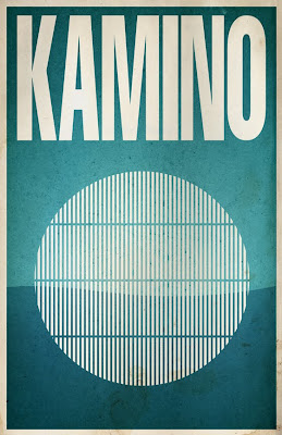
Star Wars Galaxy


Justin Van Genderen has created a great set of minimalist screen prints of various planets featured in the Star Wars galaxy. Available to buy from his etsy store.

5.8.11

EuroStemCell


Taking us back to the days of the great Geighy era are these brilliant posters by Glasgow design agency Graphical House for Euro Stem Cell. They introduced a new identity that utilises a strong, modernist Swiss style that established a new visual route for the organisation. Nice work.

1.8.11

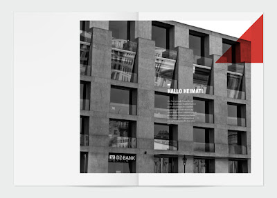
Strassenfeger


Sometimes a simple shape is enough to achieve a strong visual identity, as is the case with Rene Bieder's identity for Strassenfeger. The strong red triangle is a bold statement of intent which contrasts beautifully with the grid and Sans Serif type. I particularly like the bold greyscale images that are then overlaid with the bold contrasting red triangle.