22.11.11

Dope, Geometry Collection


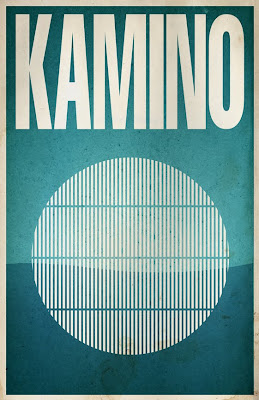
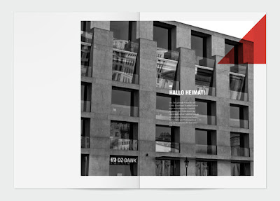
I love these tees and posters showing simple geometric forms. They have been created by the Sabri Akin as part of his graduation design project with the aim of providing an Indie clothing line. The collection called Geometry is made up of 8 tees and 8 posters. For more of his work and for the reminder of this collection check out his behance site.

28.10.11

Shin Dokho


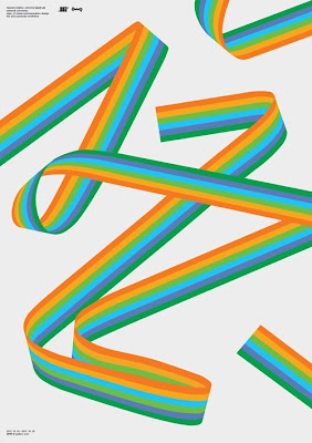
Whilst browsing on the Cargo collective I came across the work of South Korean designer Shin Dokho. His site is definitely worth a look as he has blended some very nice minimalist swiss style design with Korean typography. He also has a broad mix of other graphic design work that shows a good background of European design sensibilities.

27.10.11

GF Smith Selector


Firstly I would like to apologise for the lack of posts recently, Konstruktive have been hard at work on a couple of new identities which I hope to show later this year.

First chance I have had to comment on the new GF Smith paper selector which has been doing the rounds on design blogs worldwide. SEA have created a beautifully crafted minimalist box set in yellow and metallic silver which contains 4 separate swatch sets. The silver is prevalent throughout and gives the set a classic timeless appeal. I love the design by SEA but I am not too keen on the function as I now have to browse through 4 separate books so shall be sticking with my A5 GF Smith book from 2008!

8.9.11

Eastside Bookshop


Mihail Mihaylov has some very interesting work on his flikr photostream including this rather nice identity for the Eastside Bookshop. The simple clean typography combined with the visual pun of two bookends as the E and the B works really well. The theme is continued on posters with simple bold graphic illustrations to get the brand across.

6.9.11

Hello Couture 2012


Ryan Atkinson a designer based in Dubai, brings a fresh approach to fashion with his Hello Couture Spring/Summer collection. The graphic design is very striking with strong photographic images ovelaid with green geometric triangles of varying sizes. Whilst there is a number of elements to the design it still remains clean, balanced and tight to the grid. I love it. For more inspired modernism visit his behance site.

28.8.11

ADF Architects


Scottish design agency Graphical House have created this wonderful identity for ADF Architects. The new logo encompasses a simple graphic device; the forward slash which represents typographical the letter A. The logo also represents structure and support, perfectly on brand for an architectural firm. Great work.

23.8.11

German matchbox labels


Shailesh Chavda has a great set of German matchbox labels on his flikr stream. Most are from the sixties/seventies and are predominately inspired by Swiss and German modernism. Also worth checking out are his set of Czech matchbox labels which also have a healthy dose of modernism.

16.8.11

Vintage Porsche Posters


Whilst at work today searching for inspiration I came across these wonderful Porsche posters form the sixties and seventies on grainedit. In my opinion this really was the golden age of motor poster design; strong geometric coloured shapes and angles contrasting perfectly with strong sans serif typography. Many of these great posters were designed by Eric Strenger a native of Stuttgart that worked as a graphic designer for Porsche from 1951 to 1987.

9.8.11

Star Wars Galaxy


Justin Van Genderen has created a great set of minimalist screen prints of various planets featured in the Star Wars galaxy. Available to buy from his etsy store.

5.8.11

EuroStemCell


Taking us back to the days of the great Geighy era are these brilliant posters by Glasgow design agency Graphical House for Euro Stem Cell. They introduced a new identity that utilises a strong, modernist Swiss style that established a new visual route for the organisation. Nice work.

1.8.11

Strassenfeger


Sometimes a simple shape is enough to achieve a strong visual identity, as is the case with Rene Bieder's identity for Strassenfeger. The strong red triangle is a bold statement of intent which contrasts beautifully with the grid and Sans Serif type. I particularly like the bold greyscale images that are then overlaid with the bold contrasting red triangle.

26.7.11

National Railway Museum


The National Railway Museum in York have just introduced a new identity created by Thompson Brand Partners in Leeds. They have taken their lead of the angled parallel forms from iconography and architecture of railway history and created a simple modernist identity. There has been the usual disecting in public of the merits (hic) of the new brand on various design forums stating it was an easy and obvious solution. I personally like the identity and shall be interested to see how they progress the brand going forward and hope they steer away from the current logo overlaid on busy images.

25.7.11

Funktionsorte + Studie Eins


As you may already know from previous posts I am a hugh fan of Berlin based photographer Matthias Heiderich. He creates beautiful minimalist compositions with simple geometric shapes and colour. Every time I visit his behance site I am rewarded with beautiful modernist buildings that are vivid, surreal and very striking. Great work.

24.7.11

König Architektur


Danish design agency MuggieRamadani have created an elegant brand identity for Swiss architectural firm Konig. The two simple geometric blocks set parallel to each other is the epitome of minimalist Swiss design; simple, stripped back, where the negative space is considered as much of the design as the rectangular blocks that encompass it. Love the way a simple idea has then been applied in a number of ways creating a visually stunning identity.

23.7.11

A Grotesk Love Affair


Ryan Atkinson and Stephan de Lange created a poster featuring multiple examples of Grotesk fonts and then allowed people to vote for their favourite. The information was then translated into statistical data and used as the basis for the posters, set on a typographical grid and in the International Swiss style. Great fun idea and well executed.

13.7.11

US Dollar re-design


Wow, if only bank notes were this good we maybe inclined to hold onto them a bit longer! What more could you ask for; Helvetica, geometric shapes and modernism, beautiful work by design studio Dowling Duncan. For a full view of the conceptual US dollar re-design pop over to monomoda.

4.7.11

Adapt or Die


Many people have a view on stamp collecting much of which would be fairly derisive. However taking a look at Iain Follett's Adapt or Die flikr account would certainly change a lot of peoples viewpoint. The colection he has which was featured in Creative Reviews monograph series is virtually a who's who in graphic design with stamps (see above) designed by such legends as Wim Crouwel and Otto Treumann. It is incredible to see such great design achieved on such a small surface area. My personal favourite are the fantastic halftone images for the Munich Olympics.

1.7.11

Volkswagon


I have always been a big fan of the Beetle having owned both a 1974 saloon and a 1971 Kharmann Cabrio so it was interesting to discover The Samba a website dedicated to all things VW including a plethora of VW marketing material. Volkswagon literature has always followed the same traits of the vehicles – clean and simple. The site is split into years so it really does give you not only a history of VW but a history of advertising to. It is clear to see how the Swiss International style played its part from the late fifties and is well worth a look.

14.6.11

LA Transat


Award winning Studio Dunbar of the Netherlands are one of my favourite agencies and their website always is a rich source of modern contemporary graphic design that is backed by classic Swiss design principles. La Transat is an international yacht race funded by French insurance company AG2R La Mondial. They approached Studio Dunbar to create the visual identity that would be launched in Paris and included 125 posters measuring 4 x 3 metres. The geometric shapes combined with colours overlaying imagery of water sports look fresh and dynamic. The style is based on international maritime flags representing the alphabet. Love it.