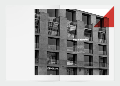

 Sometimes a simple shape is enough to achieve a strong visual identity, as is the case with Rene Bieder's identity for Strassenfeger. The strong red triangle is a bold statement of intent which contrasts beautifully with the grid and Sans Serif type. I particularly like the bold greyscale images that are then overlaid with the bold contrasting red triangle.

No comments:
Post a Comment